

Blatant Symbolism
The automotive landscape is changing, and so are its emblems.

Feeling blue, post-logo change. (photo © Pepsico)
A logo always tells a story. Not in the sense florid press releases would have one believe, but because there is no faster or more obvious an indication of corporate waywardness than the needless change of one’s logo.
Years before prospective owners could sample the British car maker’s attempt at fighting the Bavarians at their own game, Jaguar updated its logo and typography. Hence in 2012 the timeless, elegantly spaced sans-serif typeface and a minimalist leaper were gone, replaced with a far more elaborate, three-dimensional cat and an oblong, brutish typeface. So years before the subsequent, German ‘premium'-aping cars arrived, a couple of graphics heralded the beginning of a new, decidedly mainstream era for notoriously embattled Jaguar. Not merely with hindsight, it’s rather predictable how it would all turn out.

Bold statement. (images © JLR)
When Fiat abandoned its striking, modernist Five Bars logo in 1999 in favour of a an attractive, but unmemorable retro laurel leaf crown badge, this retrograde step anticipated the beginning of the end for the Italian giant as a progressive entity. Numerous rebranding efforts since then have only reinforced the impression that Fiat didn’t merely abandon some logo when its unique, unmistakable Armin Vogt-designed corporate identity was discarded, but a true symbol of a set of values that were mostly lost in due course.
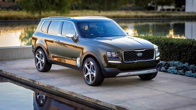
Not every logo change is for the worse, of course. Nobody would mourn the recent retirement of Kia’s long-serving logo, which acted as a constant - probably irritating to some - reminder of the brand’s humble budget car roots for the past decade. At long last, it’s in the process of being replaced with a take more in keeping with Kia’s current status, even though there are certain new issues, such as basic legibility. Like Jaguar’s current corporate identity, Kia’s isn’t too concerned with longevity either and should age rather quickly. But almost any logo would be better than the previous iteration.

‘No, not KN!’ (photo © Kia)
Kostadin Kostadinov, graphic designer and Creative Director at BRVND, has a more learned take on Kia’s new logo to offer: «Its appearance is defined by the attempt to create a symmetrical shape. Symmetry can contribute to a distinctive and memorable mark, if done successfully. Symmetry should feel natural to the common observer, it should feel like the most obvious solution. But Kia's feels forced.» Moreover, the graphic designer is also worried about the logo’s sustained appeal: «My biggest concern are the sliced-off edges of the first and last letter, surely an attempt to create a more forceful, youthful graphic, a flourish that feels too 'of the moment' and that, I would speculate, will date the logo very rapidly.» Even so, Kostadin sees positives to the new logo too - and significant ones at that: «The logotype looks much better in physical form, rendered in metal than the two-dimensional representation would suggest. Overall, despite some of the aforementioned shortcomings, my opinion is that the badge is a move forward for Kia, bringing the logo much more in line with the current quality of their brand.» Which is what a competent, if unexceptional logo can be expected to achieve.

Where Kia’s new logo provides space for ambiguity, another recently revealed effort has rightfully been lambasted by professionals and laymen alike. To describe General Motors’ new corporate identity as misguided would be lesson in diplomatic understatement. If there ever was a symbol for the crumbling giant that GM has become anno 2021, this new logo is it. With its colour gradient, lower case typography and unsophisticated proportions, it would seem appropriate for a maker of dental prostheses from Wisconsin, but certainly not for an industrial icon. But that, one can assume, was the intention, at least to a certain point - to turn GM into gm, by disconnecting it from its well-known logo first and, by association, from the smoky, greasy business of making cars. Hence the use of colours closer to those of a clear Polynesian bay than murky Lake Michigan and ‘futuristic’, pseudo-self effacing lower case lettering.

Cheap = accessible? (images © GM)
Yet to give credit for the hardly subliminal naïveté of GM’s new logo would take things too far. According to Kostadin Kostadinov, this all-new corporate identity is already an anachronism: «There was a popular trend in the late 2010s, when big companies opted for a redesign of their word mark, exchanging capital letters for an all lower case typography. It was said that this would make them appear more friendly and less corporate and/or authoritative to a younger audience. But even in a post-truth world, the truth has a nasty habit of finding its way back to the surface. Nowadays this approach is seen for what it is: a misguided attempt to abuse the vocabulary of graphic design with the intention to deceive. But it seems like nobody told the GM team tasked with creating this new logo.»
While GM intends to communicate an all-new, progressive mindset through abandoning its traditional, established and instantly recognisable logo, other carmakers see fit to significantly overhaul theirs. VW, for obvious reasons, was first to try and shed some historical baggage by lending its logo a lighter appearance. Even without immense amounts of Dieselgate soot in need of being shed this way, BMW chose a related approach for updating the traditional blue-and-white propeller logo. According to the company’s press statement, the resultant ‘transparent’ logo explains how the Bavarian car maker is 'becoming a relationship brand. The old black ring was replaced, letting the new logo radiate more openness and clarity.’

QED: the new logo is found at the top right (screenshot © BMW AG)
Having gone to the trouble of reading BMW’s entire press statement in oder to make some sense of this rebranding effort, Kostadin Kostadinov remains nonplussed: «Examining the changes and the tone of their presentation, it's hard not to imagine a corporate culture of the worst kind. Thus a significant part of the substance was removed from their logo: the solid black ring that serves to make the brand name legible. The new logo is at the mercy of whatever background is provided by the particular vehicle's body color. Or, as in the case of their website application, the background image behind it. It's hard not to conclude that a lot of elegance has been lost from the logotype, in return for nothing. I'm sure that in theory and on those PowerPoint slides, it all sounded fresh and exciting. But the reality is that the 'BMW' is now unprotected, exposed. It simply doesn't work.»
In contrast to economically stable BMW, Renault is a corporate entity that must feel highly exposed on several levels at present. In the wake of the Ghosn scandal and a string of models that weren’t accepted by the market for one reason or another, the brand is in dire need of re-orientating and reinventing itself. Against that backdrop, the introduction of an updated logo, for once, makes quite a bit of sense - even if the previous version, which was introduced in 1992 (with several changes to the typeface since), was in no need of replacing on its own merits.

Vasarely v2.0 (photo © Renault)
Alongside the retro-electric Renault 5 model, new CEO, Luca de Meo, hence presented a new logo that appears contemporary, while tipping its hat to the first modern Renault rhombus, as designed by French graphic artist, Jean-Pierre Vasarely, in 1972. As ‘a glance backwards, a step forwards’ statements go, this logo is a fine example of its kind. It doesn’t diminish what came before it the way the GM logo does. Neither does it resemble numb change-for change’s sake like BMW’s update. One large caveat remains, however, as it’s completely unclear whether this new logo was created just for the 5 or the entire brand. This is, of course, a communication, rather than design issue though.
Likewise, Dacia’s new logo - and a full-on new logo it is, that much is known - came without any explanation, but can easily be appreciated on its own terms anyway. A stark, robust, yet hardly unsophisticated guise, this new logo’s mission statement can be compared to Kia’s: It’s tasked with standing for a range of products that has exceeded the quality of its existing logo some time ago. Unlike the previous iteration, this new logo is both simpler and more sophisticated. Crucially, it also doesn’t appear like a mere placeholder anymore. So finally, Dacia has truly become its own marque, rather than being mere ‘Cheap Renault’ anymore - a well-earned success that deserves celebrating with this pleasing new badge and logo.
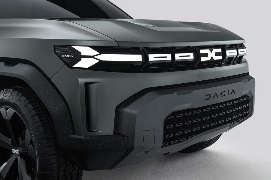
Incidentally, the first car to sport the new Dacia badge, the Bigster SUV, does so featuring an illuminated, rather than a chrome or brushed metal badge. This happens to be in keeping with VAG’s ‘light is the new chrome’ mantra - which must be considered the brightwork equivalent of all those ‘transparent’ logos, in that it’s another move aimed at changing the perception of the automobile as an industrial product into that of a consumer electronic device on wheels. But that’s another story, for another day.
